Posted on: 17/04/2025
Updated on: 17/04/2025
Code Preview
How to add your shopify Code
<html>
<style>
.flex-container {
display: flex;
flex-wrap: wrap;
justify-content: center;
}
.item-box {
margin: 10px;
text-align: center;
display: flex;
flex-direction: column;
align-items: center;
justify-content: flex-start;
}
.item-box img {
width: 30%;
border-radius: 8px;
}
.item-title {
margin: 5px 0;
}
.item-description {
margin: 5px 0;
}
.text-content {
display: flex;
flex-direction: column;
justify-content: center;
align-items: center;
padding-left: 0;
text-align: center;
}
@media (min-width: 768px) {
.item-box {
flex: 0 0 30%;
display: flex;
flex-direction: column;
align-items: center;
justify-content: flex-start;
text-align: center;
}
.item-box img {
width: 30%;
margin-bottom: 15px;
min-width: 150px;
margin-right: 0;
}
.flex-container{
display: flex;
flex-wrap: wrap;
max-width: 1000px;
align-content: center;
}
}
@media (max-width: 767px) {
.flex-container {
flex-direction: column;
}
.item-box img {
width: 32%!important;
margin-right: 0;
margin-bottom: 0;
}
.item-box {
display: flex;
flex-direction: column;
align-items: center;
justify-content: center;
flex-wrap: wrap;
text-align: center;
}
.item-box:nth-child(odd) {
flex-direction: column;
}
.item-box img, .item-box .text-content {
width: 100%;
padding-left: 0;
}
.text-content {
align-items: center;
text-align: center;
padding-left: 0;
}
}
</style>
<div class="container">
<div class="flex-container" style="padding: 30px 0px 30px 0px;">
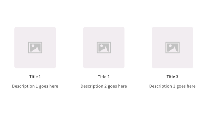
<div class="item-box">
<img src="https://encrypted-tbn0.gstatic.com/images?q=tbn:ANd9GcQQOuXSNhx4c8pKvcysPWidz4NibDU-xLeaJw&s" alt="Image 1">
<div class="text-content">
<h4 class="item-title">Title 1</h4>
<p class="item-description">Description 1 goes here</p>
</div>
</div>
<div class="item-box">
<img src="https://encrypted-tbn0.gstatic.com/images?q=tbn:ANd9GcQQOuXSNhx4c8pKvcysPWidz4NibDU-xLeaJw&s" alt="Image 2">
<div class="text-content">
<h4 class="item-title">Title 2</h4>
<p class="item-description">Description 2 goes here</p>
</div> </div>
<div class="item-box">
<img src="https://encrypted-tbn0.gstatic.com/images?q=tbn:ANd9GcQQOuXSNhx4c8pKvcysPWidz4NibDU-xLeaJw&s" alt="Image 3">
<div class="text-content">
<h4 class="item-title">Title 3</h4>
<p class="item-description">Description 3 goes here</p>
</div>
</div>
</div>
</div>
</html>
Copyright Jumping Monkey © 2025 – 2026 All Rights Reserved